Petlover · Pet care · Website redesign
Help pet owners compare sitters.
I redesigned Petlover’s homepage, sitter cards and service sections. The booking flow stayed the same; I changed the layout, type and imagery to give search and sitter details more attention.
Visual design + build · Self-initiated redesign · 2026
See the resultThe result
The same booking flow, with search and sitter details easier to find.
The finished screens show the changes to layout, imagery and type. This was a visual redesign based on my own audit. I have not tested booking completion or measured a change in trust.
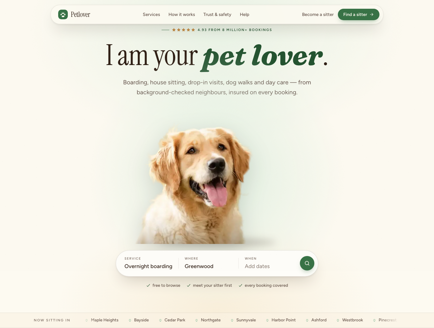
Redesigned homepage with the original copy and booking flow.
Same path
browse, compare and book without changing the existing flowBefore / after
homepage and service sections shown in both versionsVisual audit
review of the original page’s layout and informationThe problem
Search and sitter details competed with the illustrations.
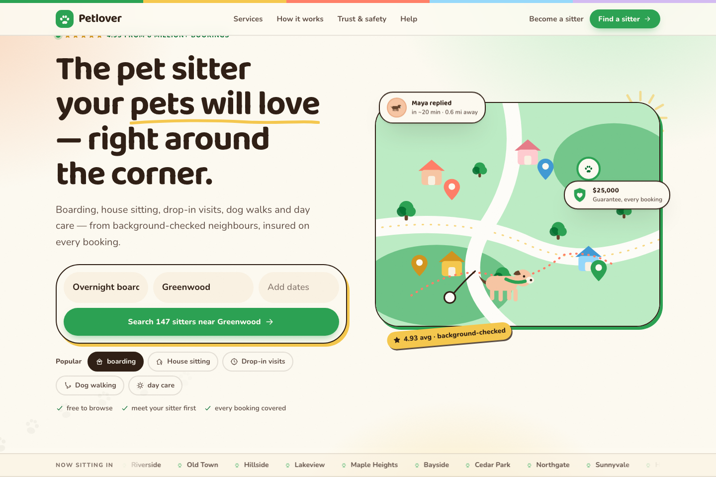
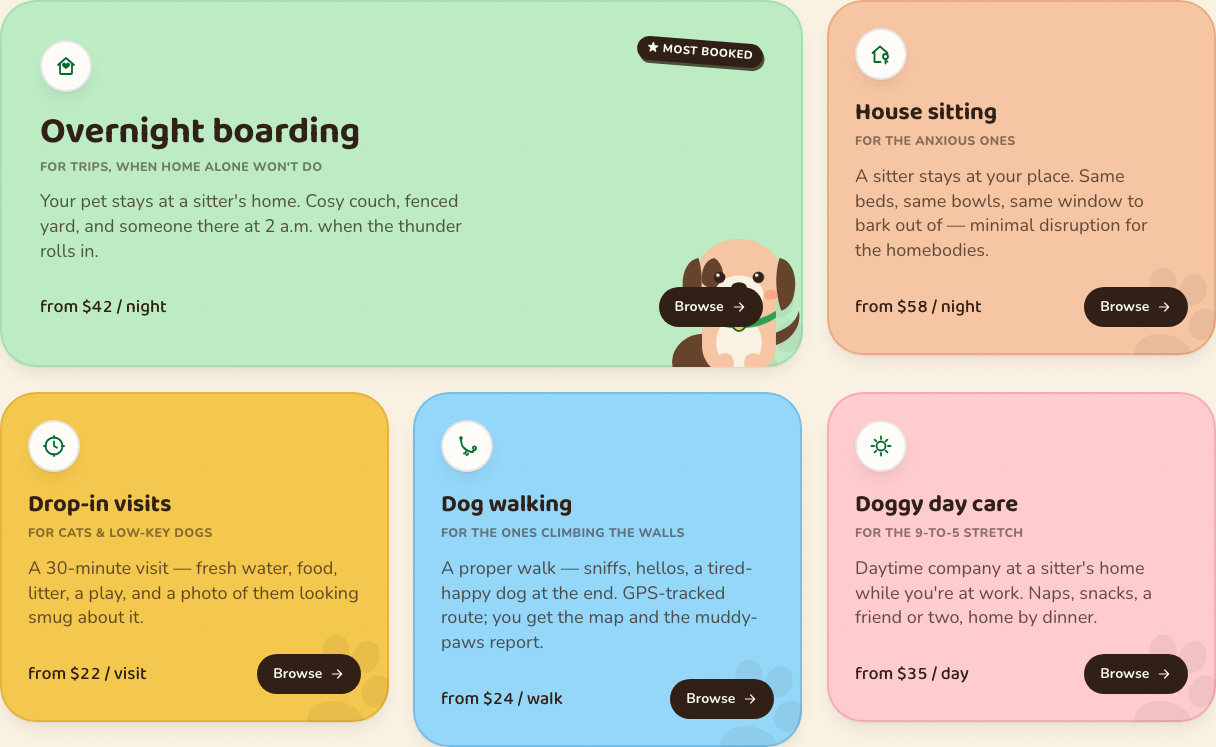
The original homepage gave colourful illustrations as much visual weight as the search and service information. In my review, it took too much scanning to find where to start looking for a sitter.
I kept the existing words and booking flow so I could focus on layout, photography and type.
What should an owner see before opening a sitter’s profile?
Decision
Put search below the introduction.
I replaced the illustrated scene with a pet photograph and placed search directly below the headline. The service description and search now form one group, so visitors can read what Petlover offers and start looking for care in the same area.
Decision
Keep the comparison details on each card.
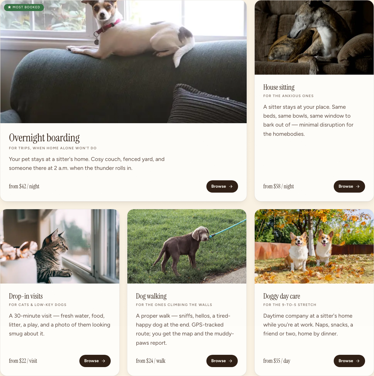
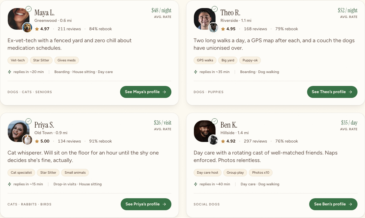
The sitter cards bring location, price, reviews, services and verification together. I kept those details visible even though they make the cards denser. Removing them would leave owners with a photograph and a name, then require another click to compare sitters.
Decision
Group the safety information.
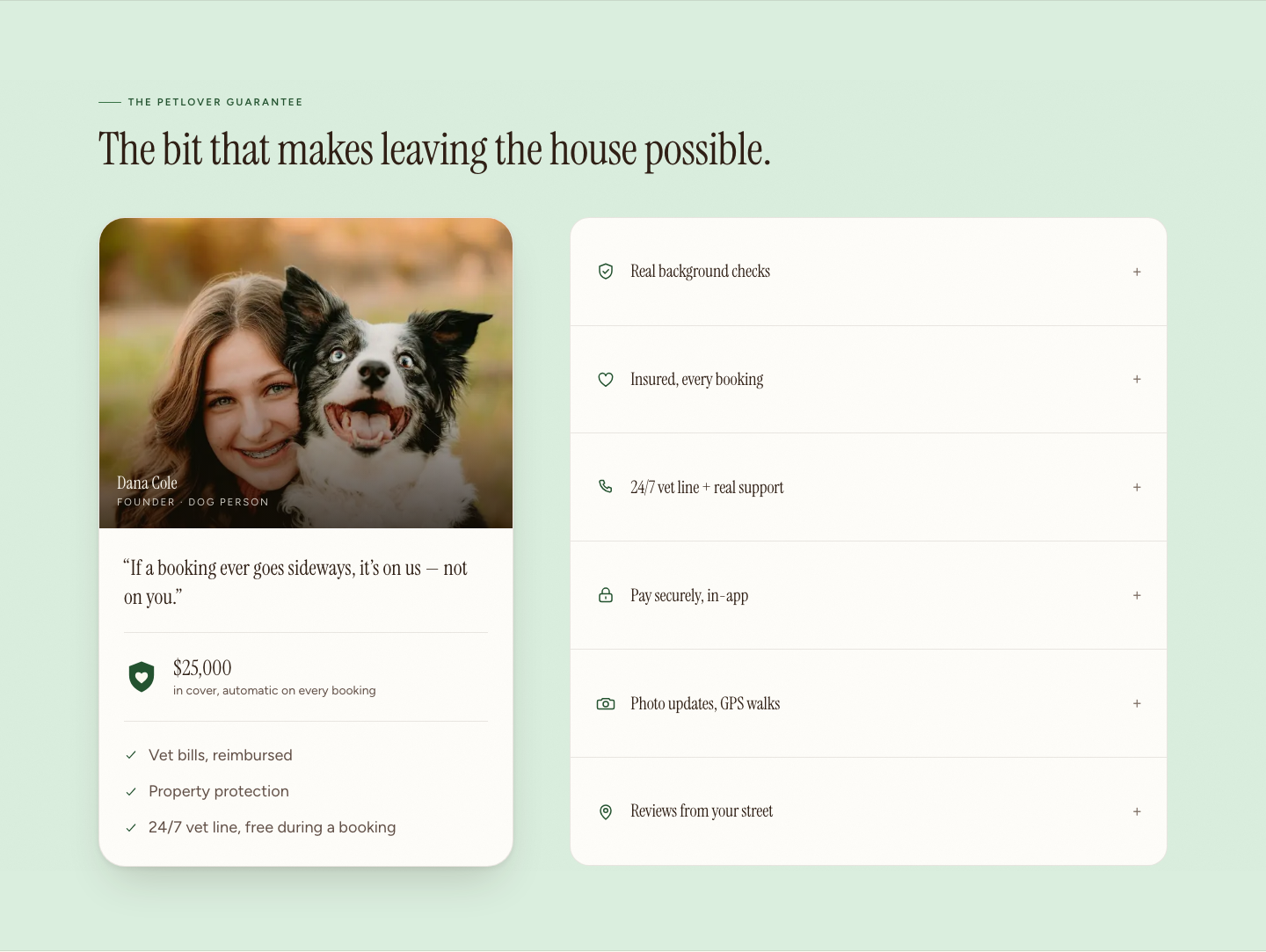
I reduced decoration around the protection and support details and gave the text more space. This section uses the same type sizes and colours as the sitter cards. Owners can review the service’s safety information without a change in reading style.
Before and after
The same booking flow, presented differently.
The product copy and booking path stay constant. Compare the hierarchy, imagery and emphasis.